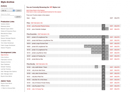
Style Archive: Early in my Stewart+Brown career, I was the production assistant and part of my job was tracking samples and production. I kept a list on excel of all the styles we had ever made and one of my first programs ever was putting that list online. I just looked at some of the other code on the site and after figuring out what an array was, made it work for me. Over the years I built more and more functions into the system and by the time I left it had a life of it’s own and was responsible for tracking nearly every aspect of design, development and production. It was so efficient that we even opted out of purchasing an expensive out of the box system that was really popular within the industry. I like to pat myself on the back for that and the fact that even a year after I’ve left the system is still up and running with no major problems or errors. What you see to the left is a list of all the styles for a season with boxes representing every season they have been produced in.

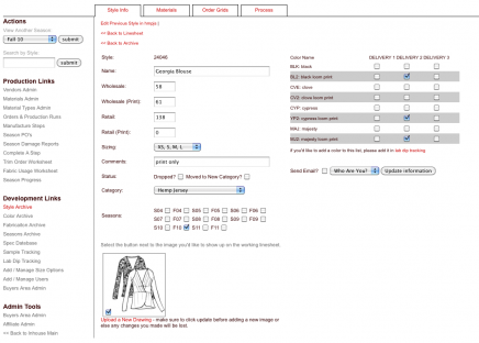
Style Info Page: This is the page you get to when you click from the previous page. It displays all of the product information and is continually updated as the product is developed. Available colors are specific to the season (as tracked by another tool) and are specific to each delivery. This information is used everywhere this style is shown on the site and so updating information is as easy as updating it in this single location.

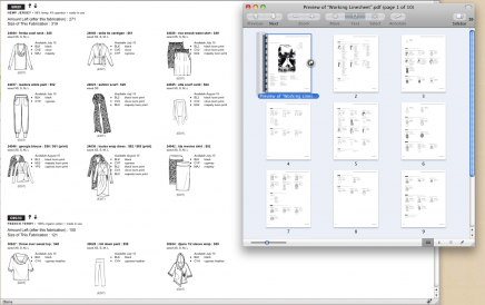
Autogenerated Line Sheets: This information in the style archive populates a linesheet that is used to send to buyers and showrooms to place their orders. Previously, we build these files in Illustrator and they took forever to make and were always filled with errors since information is constantly changing. Since all of the information was most up to date, I proposed converting the linesheet to being something created online. I had to fight for it since others were afraid that it would compromise the design and layout. I created the layout based on an existing line sheet and made if fully customizable. You can control what styles go on which page, the order of the styles and even control which distributors could see which styles. To create the pdf, one just hits print and the prints it to a pdf with out all the editing marks. Works like a charm.

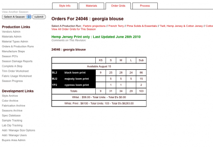
Style Orders Page: This shows the order grids for this style. Orders are input online in a common area and are used by the system to calculate the amount of fabric and materials to order in addition to providing a central location in which to view an share information. Before this, all orders were on paper and revisions were lost and mistakes rampant. Even when we were just testing the system, we found a discrepancy between orders, hazzah! Orders are also subdivided for delivery and tracked by projections and actuals.
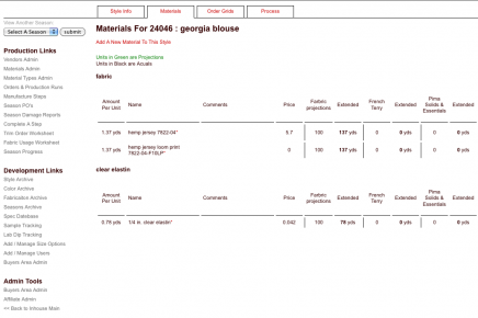
Style Materials: This tab on the style shows the materials and amounts of materials used based on the order grids. This aids the production team in tracking orders and pricing.
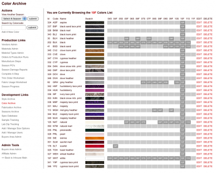
Color Archive: Similar to the styles archive, another archive exists for each color Stewart+Brown developed showing which season it was used as well as a swatch that is used in every other place on the site where this color is shown. When adding a color, it checks to make sure the color code or name hasn’t been used.
Pattern Specs Tracking: Before a style can be sampled there has to be an approved pattern for the style. It works as follows, the designer comes up with an idea for a garment. The pattern maker (who’s craft is amazingly interesting to me) makes a pattern for the idea. The pattern is sewn and fit and the pattern is adjusted for a better fit. This database tracks these revisions and all the files are hosted on the server so they can be downloaded and shared at anytime. Status updates are also applied to let others know when the pattern is approved or what adjustments it needed.

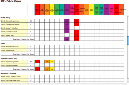
Fabric Usage Chart: This chart is an extension to our production tracking system. I love how colorful it is, I like to think that It makes looking at the information a little more fun. What we are showing in this chart is how much of each fabric it takes to make 1 of a certain style. They are ordered by fabrication (i.e. organic jersey, hemp-jersey, fleece) and totals are shown at the bottom of each fabrication as well as a grand total grid at the bottom of the sheet. This helps the girls in development get an accurate picture of how much fabric they will have to order for a given season. Before orders are actually placed, they can just get a rough idea by style and after orders are input, they get an even more accurate number because for each production run, the system will automatically calculate how much of each style was ordered and multiply it by the yield. This tool also references our “Spec Archive” where the girls in development and the pattern maker go to upload spec’s for each style and, if the spec is approved, the style shows up in yellow.

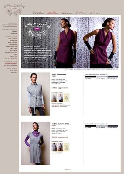
This Buyers Area is a password protected area on the Stewart+Brown site for retailers to go to preview the incoming season early. The design was based on our e-store but formatted so that the buyer can see each fabrication on it’s own page. Currently, I have the buyers area linked into a number of back end tools that manage the production and development process. If someone in production decides we’re not going run a color in a style, they can update it in the back-end and it will automatically update in the Buyers Area as well. This has really helped us cut down on communication errors and it ensures that buyers are always getting the most up to date information.
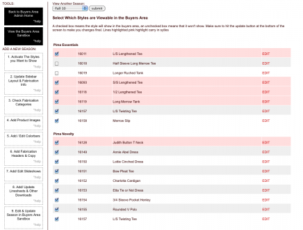
Buyers Area Style Selection: I built this tool that guides users through the process of adding a new season to the buyer area. Each link on the left is a step in the order it should be performed and the first step is selecting the styles that you want to be shown.
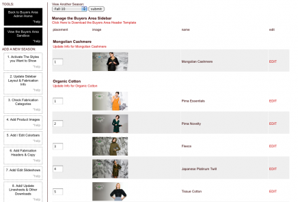
Edit Fabrications and Sidebar Ordering: In the buyers area, styles are organized by fabrication. This interface allows you to edit the images shown at the header for each fabrication, the text used to describe the interface as well as the order of the fabrication on the sidebar.
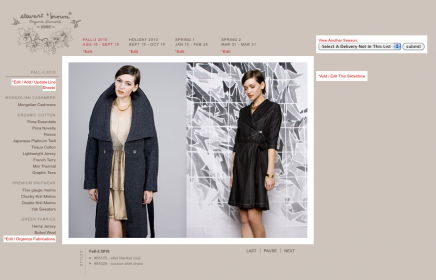
Buyers Area Editing Sandbox: I realize the fact that using admin tools isn’t the ideal way for many people to add, edit and view information so I build this “sandbox” to use for editing. It is an exact replica of the buyers area except that each editable field has a link to the place that information can be edited.

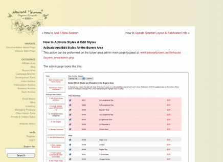
Admin Documentation: I set another wordpress blog to serve as a help area for anyone using the system. Every tool I built has it’s own “how to” page and since it was built in WordPress, it came with the search functionality, the categorization and comment capabilities. The comments have been used as a way to add to or comment on the help instructions.
